
Open the original TradingView chart
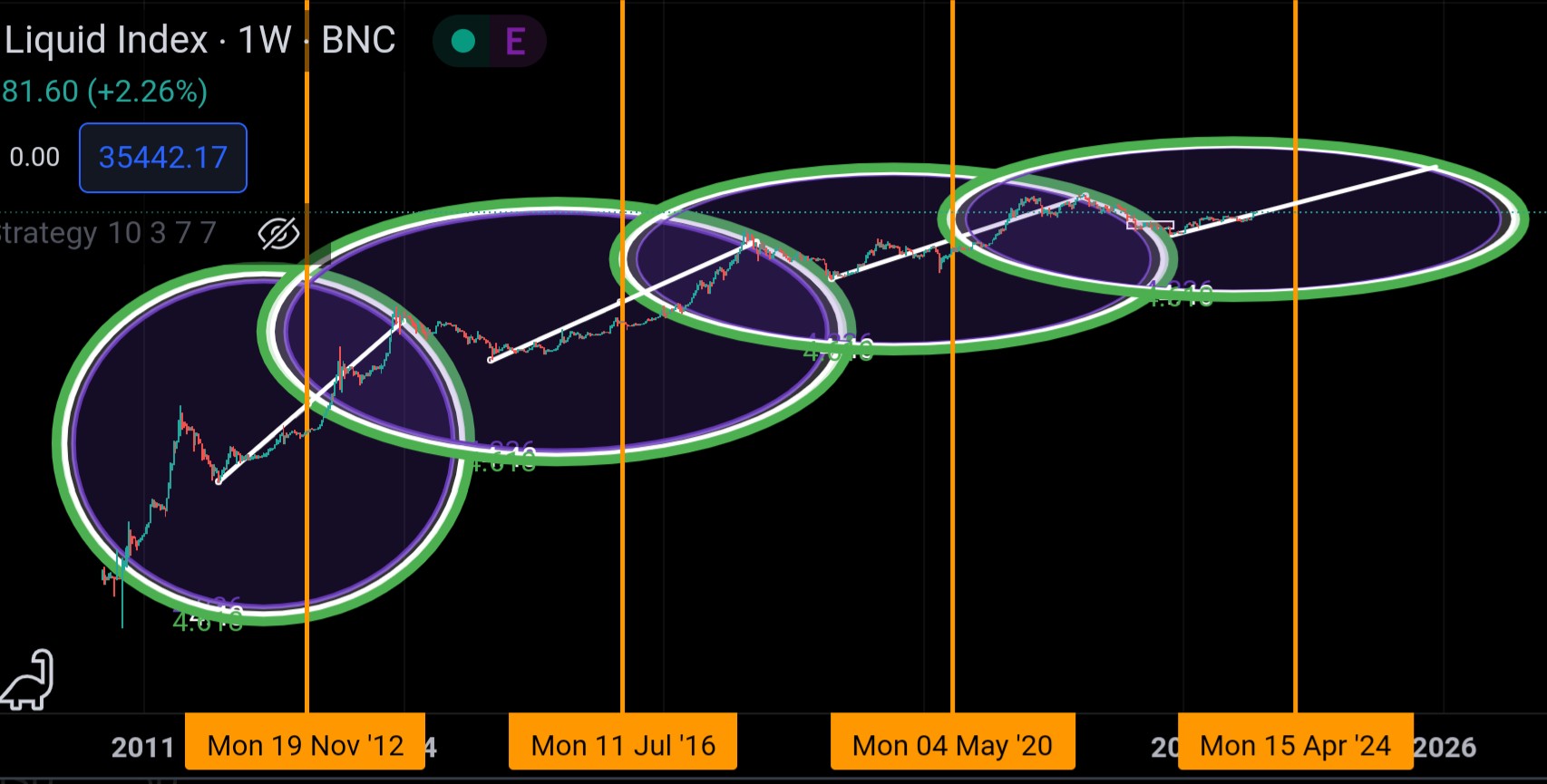
I created “Satoshi Circles” as a visual way to think about Bitcoin cycles. The method anchors Fibonacci circles to a cycle low and a halving date, then looks for the price path to intersect a projected region.
It produces an elegant chart. Elegance is not evidence.
Now that the April 2024 halving is historical rather than future, this page is more useful as a lesson in model testing than as a fresh price target.
The original method
- Mark a Bitcoin halving date.
- Select the preceding cycle low.
- Draw a trend line between the low and the halving.
- Use that distance and time span to size a Fibonacci circle.
- Extend the chart and interpret later intersections as possible market-top regions.
The construction mixes two intuitions: halvings change new supply issuance, and Fibonacci ratios often appear in trader tools. The result can provide a consistent visual vocabulary for comparing cycles.
Why it feels persuasive
Humans are excellent pattern detectors. Financial charts amplify that strength and its failure modes:
- A circle can be resized or repositioned until it touches important points.
- Logarithmic and linear price scales produce different geometry.
- The definition of “cycle low” may be obvious only afterward.
- A broad projected region is easier to “hit” than a precise forecast.
- Failed versions disappear while a visually successful chart gets shared.
This does not prove the method useless. It means the rules must be frozen before the future data is visible.
Make the hypothesis falsifiable
A serious test needs a written protocol:
- data source and candle interval;
- linear or logarithmic scale;
- exact rule for selecting the cycle low;
- exact halving timestamp;
- fixed Fibonacci ratios;
- objective definition of the predicted window;
- price and time tolerance;
- invalidation date;
- comparison with simple baselines.
Then save the chart and a hash or public timestamp before the prediction window. Do not redraw it afterward.
Compare it with boring alternatives
A charting method should outperform something. Useful baselines include:
- buy and hold;
- a fixed interval after each halving;
- a moving-average rule;
- a simple logarithmic growth curve;
- random windows with the same width.
If a large circle captures most of the chart, its hit rate is not impressive. Score both precision and coverage.
Avoid trading a picture
Even a genuine cycle relationship would not guarantee an exact price or date. Bitcoin reacts to liquidity, leverage, regulation, custody failures, adoption, mining economics, and events no chart encodes.
A visual model can help create scenarios:
- What will I do if price enters the region?
- What will I do if it never does?
- How much concentration risk am I willing to hold?
- Which decision is driven by my needs rather than a prediction?
That is more useful than treating geometry as destiny.
What I keep from Satoshi Circles
I still like the chart as a creative model. It connects Bitcoin's programmatic issuance with a geometric way of visualizing time and price. But its proper status is hypothesis, not oracle.
The updated lesson is stronger than a target: write the rule before the outcome, compare it with a baseline, preserve the misses, and never risk money on a pattern you cannot define precisely.
This is not financial advice. For my broader thesis, read Why Bitcoin changed how I think about money.